
Rethinking Me360
When the founder of Me360 reached out to me to help with their rebrand, I jumped at the opportunity to help them define their message – and organize it in a way that made more sense for the user. Let me walk you through some of the changes.

The problem: As Me360, the website was unclear on who exactly they were targeting. The initial message featured their main offering – skill training. Over time, they realized that employees weren’t the ones they needed to be convincing… it was People Ops teams.

The solution: Focus on the most important benefit for the people searching for this product. Don’t get into the “How,” and focus only on the high-level “What” and “Why”
Updated copy | Former copy


A better user experience
The problem:
Users still didn’t seem to understand what the product was, even after reading the former site. The sales team still spent most of their calls explaining why the product was needed in the first place.
The solution:
Instead of describing the technical elements of the product, I shifted the focus to data-driven reasons for why the product benefits the company, and focused on how smarter tech allows for smarter training.
Updated content strategy:
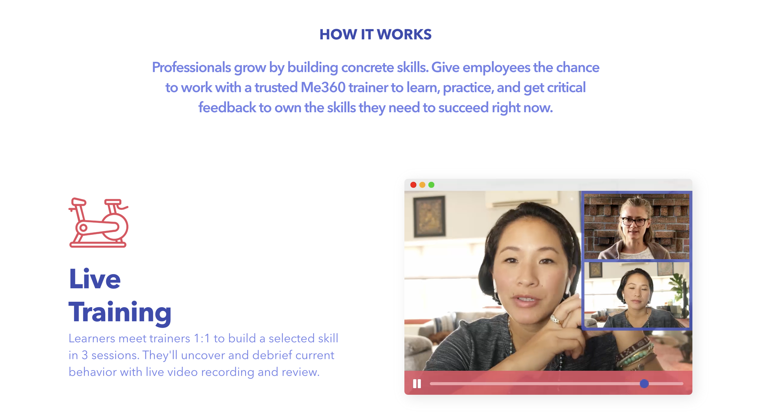
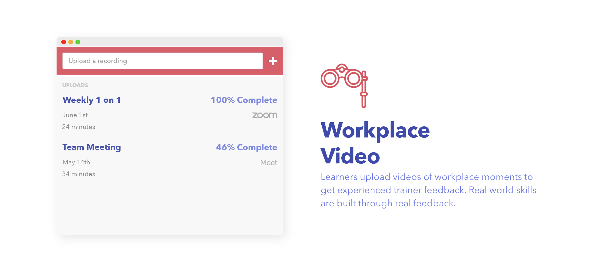
With the homepage now focused on establishing the user problem and product solution, I was able to build out a more in-depth “How it Works” section. By moving the “how” to its own page, there was much more real estate for answering the questions that arose once the user was actually interested in the product.